Whoremaster
Registered: 10/21/05
Posts: 2710
|
Quote:
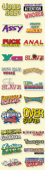
I wonder what the low-contrast yellow lettering above Alexis Texas' name says?
King beat me to it, but...
Quote:
I can take font variance when it's used to group items together or separate out trademarks, but high contrast is a must. If it isn't worth giving high contrast or making big enough to read at a glance it in't worth putting no the box in the first place.
...there's a good reason why some of the text is low contrast as opposed to high. It is there to make you pick the thing up off of the shelf and look at it more closely, and odds are that once you've picked it up, you'll also flip it over and take a peek at the back cover where the real dealmakers and heartbreakers are located.
The design of Jules' and EA's covers take into account a number of retail scenarios. If we take your example of a single face display (i.e., entire cover displayed) at a slight backward tilt in a harshly/poorly lit environment, then the majority of the cover will often be 'whited out' by the reflection on the DVD's transparent sleeve pocket from the harsh overhead lighting. Depending on the strength of the light, you could be talking about 3/5 or 2/4 of the cover obscured, and it will be the dead centre that gets bleached out which is where all the eye-catching imagery is. This is why JJV and EA have header bars at the very top of the sleeve.
If said DVDs are displayed in a vertical slant (i.e., 'staircase style'), then again said header bars will be all that is visible, and the customer can quickly identify the product.
If displayed in a horizontal slant (the next dvd to the right over lapping the previous one anywhere from 50-75%), then EA and Jules have a logo in the top left corner (just like most comic book companies, and for exactly the same reason) of their boxes which again anticipates the worst case retail scenario. Indeed, the mirrored 'J' layout of Jules' header bar even takes into account the possibility of a reversed horizontal slant display (which probably only happens in Asian countries where they read right to left, or in the West when someone wants to commit retail suicide).
That sleeve is a professional job, design-wise...you could stack it upside down (or an inconsiderate customer could leave it that way) in a vertical slant display and there would still be a JJV logo visible for quick identification (the one in the bottom right corner). 
|


 Previous Topic
 Index
Index