I wonder what the low-contrast yellow lettering above Alexis Texas' name says?
These box covers will be seen in poorly-lit porn stores, definitely not at a good angle (bottom shelf) in Jake Steed's case. I can take font variance when it's used to group items together or separate out trademarks, but high contrast is a must. If it isn't worth giving high contrast or making big enough to read at a glance it in't worth putting no the box in the first place.
Quote:
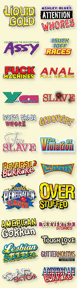
The guy breaks one of the basic design no-nos: don't use a lot of differnent fonts. What other font and general design disasters can you find.

_________________________
"If they can't picture me with a knife, forcing them to strip in an alley, I don't want any part of it. It's humiliating." - windsock


 Previous Topic
 Index
Index