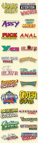
Quote: The guy breaks one of the basic design no-nos: don't use a lot of differnent fonts. What other font and general design disasters can you find.
Have to disagree with you here Zen...the use of different fonts helps the eye/brain quickly differentiate between each piece of text and the inherent relevance and importance thereof. By and large, I think Jules' covers are pretty sharp for a gonzo outfit.
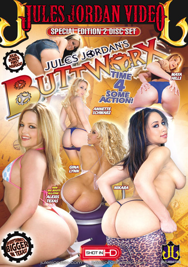
Whether you are aware of it or not, here is how you will 'read' this cover:
1) Brand (the JJV header) 2) Title (Buttworx) 3) Tagline (Time 4 Some Action!) 4) Director (Jules Jordan..duh!) 5) The 'Pill' (Special Edtion 2 Disc Set) 6) The Talent 7) Bottom Row Graphics (Cog, JJV Logo, Shot in HD pill) 8) Julia Bond's smaller cog.
The photo composition is designed to take your eye around the cover in a clockwise movement. The direction of Gina Lynn's butt is the clue.
There's nothing wrong with using different fonts per se...it's when people use jarringly different and utterly inappropriate fonts that the shit hits the fan design-wise.


 Previous Topic
 Index
Index